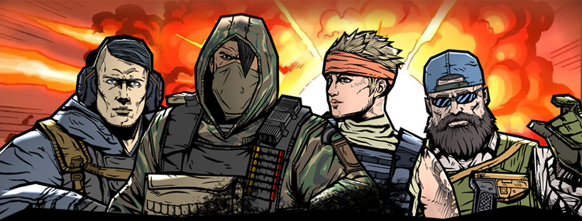
I had the opportunity to lead the UI/UX design for a first-person shooter game called "Military". It was an exciting and rewarding challenge to create a UI that met the game's requirements and went beyond the industry norms at the time.
To ensure the UI reflected the essence of the game, we opted for a simple and intuitive design. By breaking away from the traditional UI styles, we managed to find a way to further optimize the UI in both memory use and implementation time that I’m proud of.

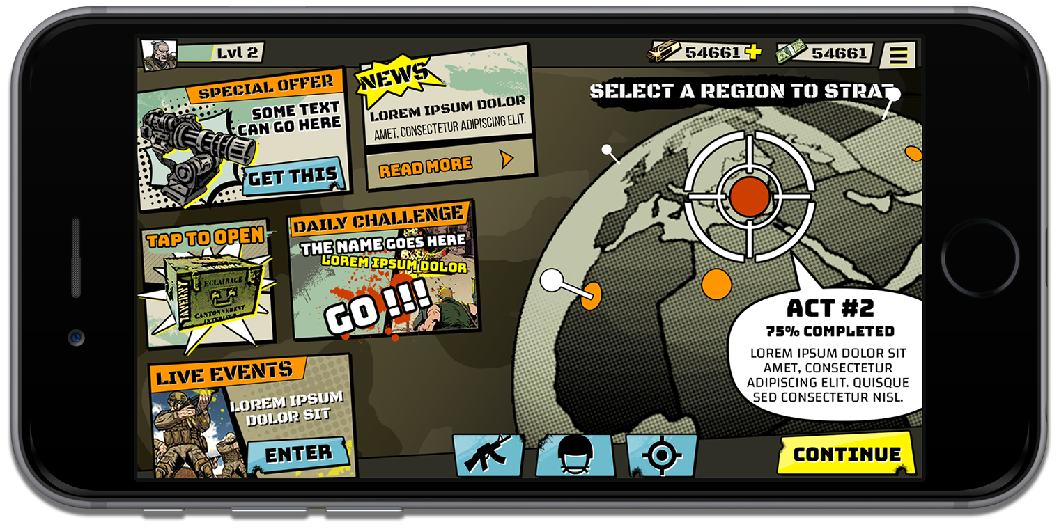
The UI concept began with the design of a globe that met all the necessary requirements for the game's theme and functionality. The globe was designed to have a military look, with a 2D appearance that avoided being too flat and provided a sense of different locations for various missions.
The simplicity of the globe design allowed it to serve as a focal point for the rest of the UI. The visual elements used in the globe's design, such as the dark outlines and halftone patterns, set the overall aesthetic for the game's UI. These design choices, along with the selected color scheme, ensured consistency and coherence across different screens and menus.

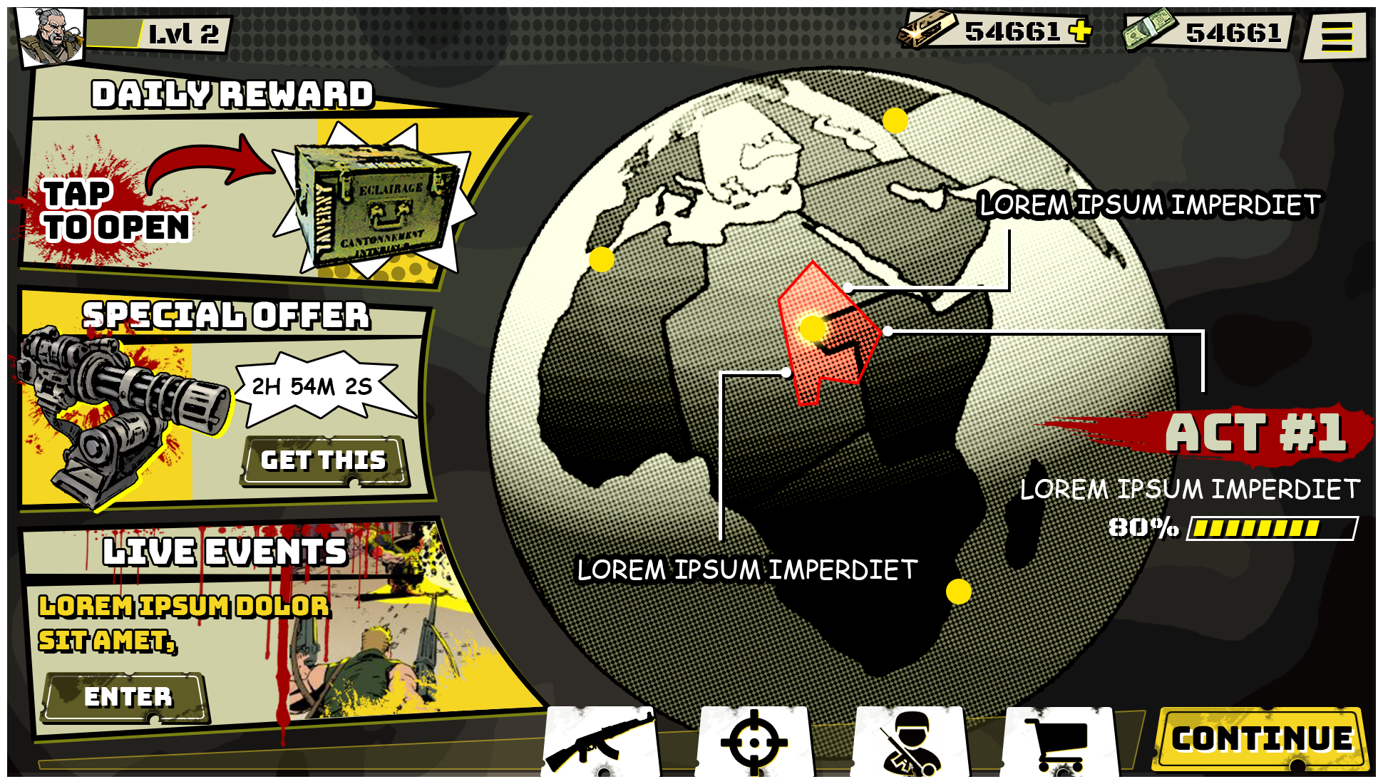

Incorporating the globe as an interactive element in the Home Screen of the military game was a fun and engaging feature. By allowing players to spin the globe and explore different areas for missions, it added an extra layer of immersion and interactivity to the gameplay experience.
The interactive globe feature provided players with a sense of agency and exploration. Instead of presenting a static menu of missions, players could actively engage with the globe and discover different locations for missions. This not only made the Home Screen more visually appealing but also encouraged players to interact with the game and actively seek out new challenges.
The ability to spin the globe in any direction expanded the possibilities for mission selection. Players could freely explore various regions and discover new missions in different parts of the globe.

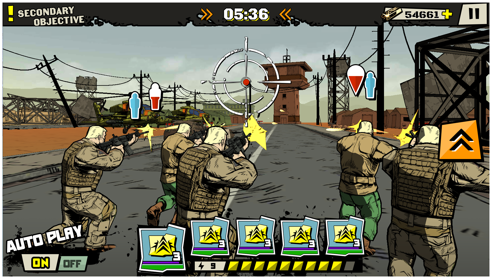
User testing played a crucial role in fine-tuning the gameplay controllers. It allowed for gathering feedback on the usability, intuitiveness, and effectiveness of the UI design.


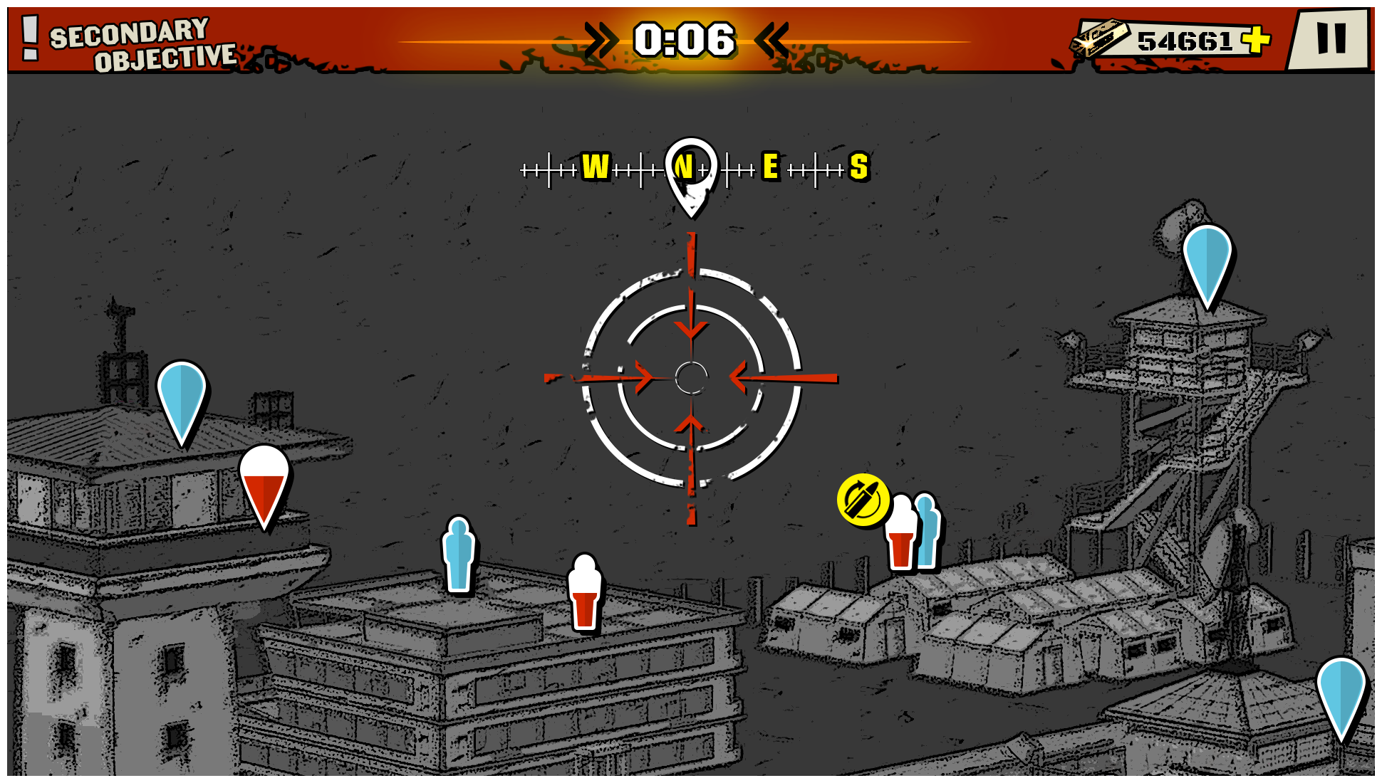
In the development of the air assault portion of the game, extensive user testing was conducted to ensure that the UI effectively conveyed the direction and location of the target to the player. This aspect was particularly important in creating a realistic and immersive experience for the players.